February 06, 2025
Introducing Plaid’s new brand: The fabric of financial progress
Plaid's journey and brand began with a serendipitous moment. Our founders whiteboarded a complex algorithmic visualization to identify the location of a transaction. The cross-hatched pattern that emerged was left forgotten on the board, but it eventually clicked as resembling a plaid pattern. A quick search for the plaid.com domain availability sealed the deal. And Plaid became official.
That was nearly 12 years ago. Since then, the world of digital finance has completely changed—as have we.
With 1 in 2 banked Americans having used Plaid, we’re widely recognized as powering the connection between apps and financial institutions consumers use to build better financial lives. Our expanding platform of products and our growing network—built on data and insights from hundreds of millions of account connections, activity, and signals—are enabling the next generation of financial products and experiences. We’re changing how businesses of every size and industry onboard users, fight fraud, accept payments, and make lending decisions while making financial experiences easier, faster, and more secure for consumers everywhere.
The financial industry has also evolved. Just this past decade, we've seen rapid growth of fintech companies, and we're honored to be a key part of that ecosystem with 7,000 companies building with Plaid. We’ve seen crypto rise and fall and rise again. Payments have diversified to include peer-to-peer platforms and digital wallets, in addition to being embedded across apps, experiences, and smart devices. At the same time, it’s critical that these new methods and systems provide the same or better reliability and security to reinforce the trust we’ve built in our financial tools and systems over the past centuries. Innovation in security and fraud is vital.
As we enter the next era of digital financial experiences, we need a brand that better reflects who we are now and the exciting places we’re going. We need a brand that doesn’t just represent a ground-breaking account-linking solution, but also the one-of-a-kind financial data network we have become.
Today, we’re excited to introduce our new brand that reflects Plaid’s role as the fabric of financial progress.
The fabric of financial progress
We believe the future of finance is digital, but it’s built on the shoulders of the financial world—the beauty and the heritage—that precedes us.
If you remember the transition to digital music, you might have nostalgia for album booklets and liner notes, which are nearly obsolete. As people are increasingly turning to digital payments, especially as central banks adopt digital currency and countries introduce real-time payment systems, paper money is becoming less prominent in our hands.
Developed by our internal brand, creative, and product design teams, our new brand identity bridges the history of finance and the future of our industry. Inspired by the art, design, and beauty of paper currency from around the world, the intricate guilloche patterns, woodcut illustrations, and holographic strips of analog cash take on new forms to represent a vibrant digital future.
It’s all about the Benjamins
If you’ve ever spent time really looking at a piece of paper money, it’s quite stunning—and powerful. Different colors and dimensions (especially outside of the U.S.) make it possible to transact quickly and confidently. The holographic strips not only create visual interest but are a sign of security. Guilloche patterns—the intricate engravings taking the form of complex curves and spirals—were introduced in the 1800s to reduce the printing of counterfeit money. We've built our new brand on top of this legacy, using guilloche as inspiration for our patterns and the holographic strip as the foundation of our color palette.
The structure of our financial systems was built on top of the insight and innovation of those who came before us, including pioneers in politics, arts, and science. Around the world, currencies honor these individuals with woodcut illustrations. We are paying homage to the style with modern updates and playful twists.
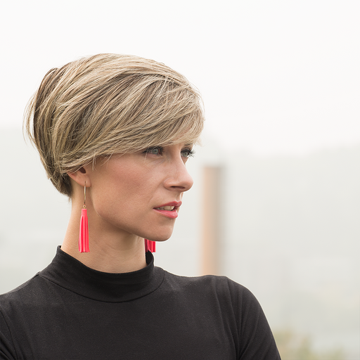
Our photography opens up the holographic strip and immerses us in a vivid, light-filled world. Here, familiar objects from finance and tech are reimagined to represent a bright future where financial technology is easy to build and use.
The world of finance is dense and convoluted. As with our products, we aim to make it simple, and we're continuing on with our distinctive writing style that’s clear, concise, and conversational.
Our logo is an element of our history that we’re taking unchanged into our future. It continues to inspire us to create the connections that unlock financial freedom for everyone.
Connecting to the future
The future of the financial world is connected and personalized. It’s smarter and safer. It gives people everywhere more control, transparency, and choice. Reimagining our brand for this future has been an energizing journey for us because it extends so much farther than ourselves—weaving itself through the products and experiences our customers and partners bring to life for consumers across our network.
As Plaid becomes integrated more deeply across the financial ecosystem—from when a consumer signs up for a new app to applying for a loan to paying with their bank account—we know this new brand will remain a signal of progress, security, and trust. We can’t wait for you to experience it.
Acknowledgments
Special thanks to Chris Warner, Ryan Smith, Amy Wong, Tori Cincotta, Lindsay Grizzard, Jeremy Tribby, Gabbi Sanchez Mallona, Greg Makrigiorgos, Ellis Yu, and Jamie Kelly. And a big thanks to the entire team across creative, product design, engineering, and marketing for all their contributions.

