Link messaging
Shape your messaging around Link to optimize conversion and user experience
Overview
Factors that you control, such as how Link is placed in your onboarding flow, and the UI of the page where it is hosted, can have large impacts on Link conversion. This article outlines best practices for Link presentation that you can adopt to maximize conversion and overall user experience.
Pre-Link messaging best practices
Explain the benefit to the user, in direct, concise language
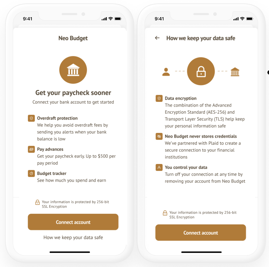
Your UI should tell the user why they want to use Link. For example, linking an account might let them make free transfers, versus having to pay a credit card transaction fee. Or it might be faster, allowing them to avoid manual data entry of balances or transactions, or having to wait several days for a micro-deposit-based verification flow.
When explaining the benefits, use concise explanations, rather than displaying large blocks of text. If you need to provide more details to fully explain something, you can use a "learn more" link to display a modal with additional information.
When providing value props, two bullets is best. Only use more than two if the additional bullets convey financial benefits, such as "Access funds instantly," "Get the best available rate", or "No fees". For best uptake, consider putting the strongest value prop in the header if it is compelling, e.g. "Add a bank account to move money with no fees."
In the Link CTA, "add a bank account" is preferable to "connect a bank account" or "link a bank account" for most use cases. "Add instantly" is a strong example CTA -- the word "instantly" drives user uptake.
Tell the user what to expect, including what data is shared and why
Before launching the Link flow, explain to the user that they'll be prompted to link a bank account with Plaid. Explain what data your app will be collecting from their account, and why it's needed. Because long blocks of text can reduce Link uptake, the best approach is to provide a concise, user-friendly explanation of how your app uses data from Plaid, then link to your Privacy Policy or other documents if needed for a more comprehensive explanation.
Present Link as the default
Rather than presenting Link and manual flows as equal alternatives, encourage your customers to use Link through the size, positioning, and color of the Link entry point. You can also use labels such as "Recommended" or "Preferred". Yet another option is to display manual flows as an option only after the onExit callback (indicating a failed link attempt) has been received.
Explain that Link is secure
Let customers know that Link is secure and uses 256-bit encryption; a lock icon can also be used to help convey that Link uses encryption. Explain that your app does not have access to their credentials. If your app implements the best practice of allowing users to disconnect accounts from within the app, explaining that they can choose to unlink their account later can increase users' confidence in their control over their data.
Do not use Plaid in your Link URL
Using the string "Plaid" in the URL of the page from which Link is launched, especially in the subdomain (for example, https://plaid.wonderwallet.com) may cause customer confusion regarding the boundaries between your app and Plaid.
Provide a polished, engaging flow
A Link hosting flow that is engaging, polished, and reflects your brand conveys the legitimacy and importance of linking an account. Illustrations and interactive elements can all be a part of your pre-Link messaging.
Use multiple channels to engage users
If a user does not link an account during their first interaction with your app, you can use other channels such as email, text, or mobile notifications to remind them. These channels should use the same best practices as your in-app UI. You can also use these channels to notify users when they need to take action to repair a linked account via update mode.
If possible, use Embedded Institution Search
Embedded Institution Search has been shown to increase the percentage of users who link an account with Plaid.
Pre-Link messaging examples
Below are some examples of fictional Plaid-powered apps that incorporate elements of best-practice messaging. While every app will have its own unique pre-Link UI, these examples are intended to provide inspiration and demonstrate how the principles above can be applied.
Payments example
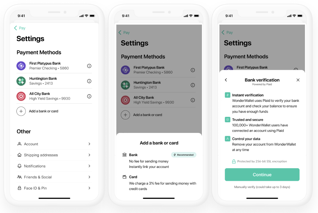
This pre-Link flow conveys the benefit to the user, presents Link as the default experience, and uses social proof to show that Link is a secure solution trusted by many users. It mentions Plaid by name before launching the Link flow, helping the user understand that Plaid is trusted by the app. It also clearly explains what customer-permissioned data the app will be using, how that data will be used, and that the user can revoke access to that data.
Lending examples
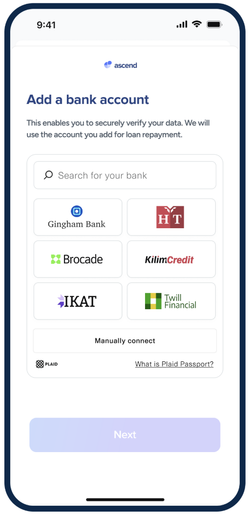
This pane uses Embedded Institution Search to increase uptake and uses direct language like "Add a bank account".
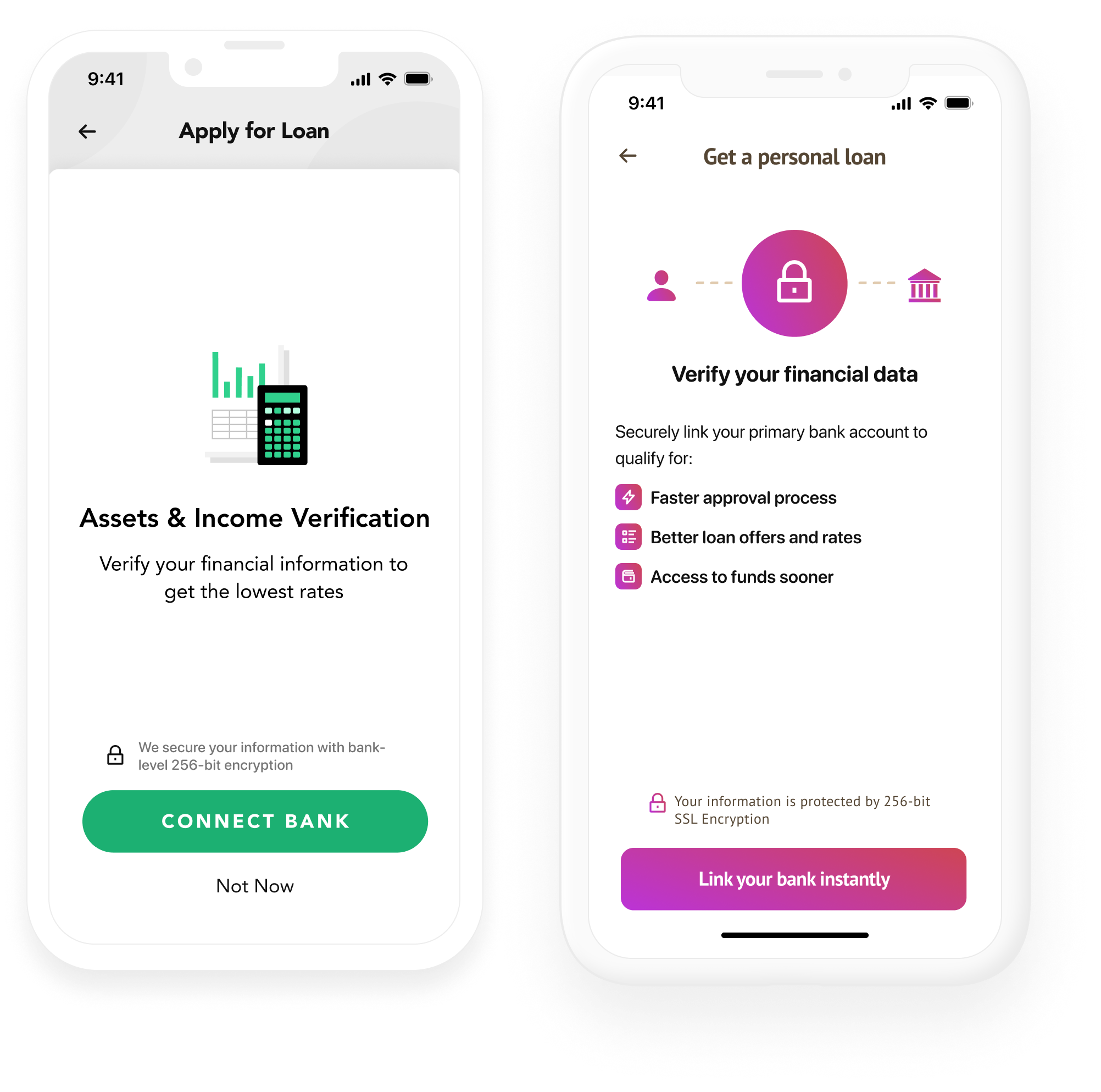
These pre-Link panes convey the benefit to the user of linking an account, present Link as the default experience, and explain that Link is secure.
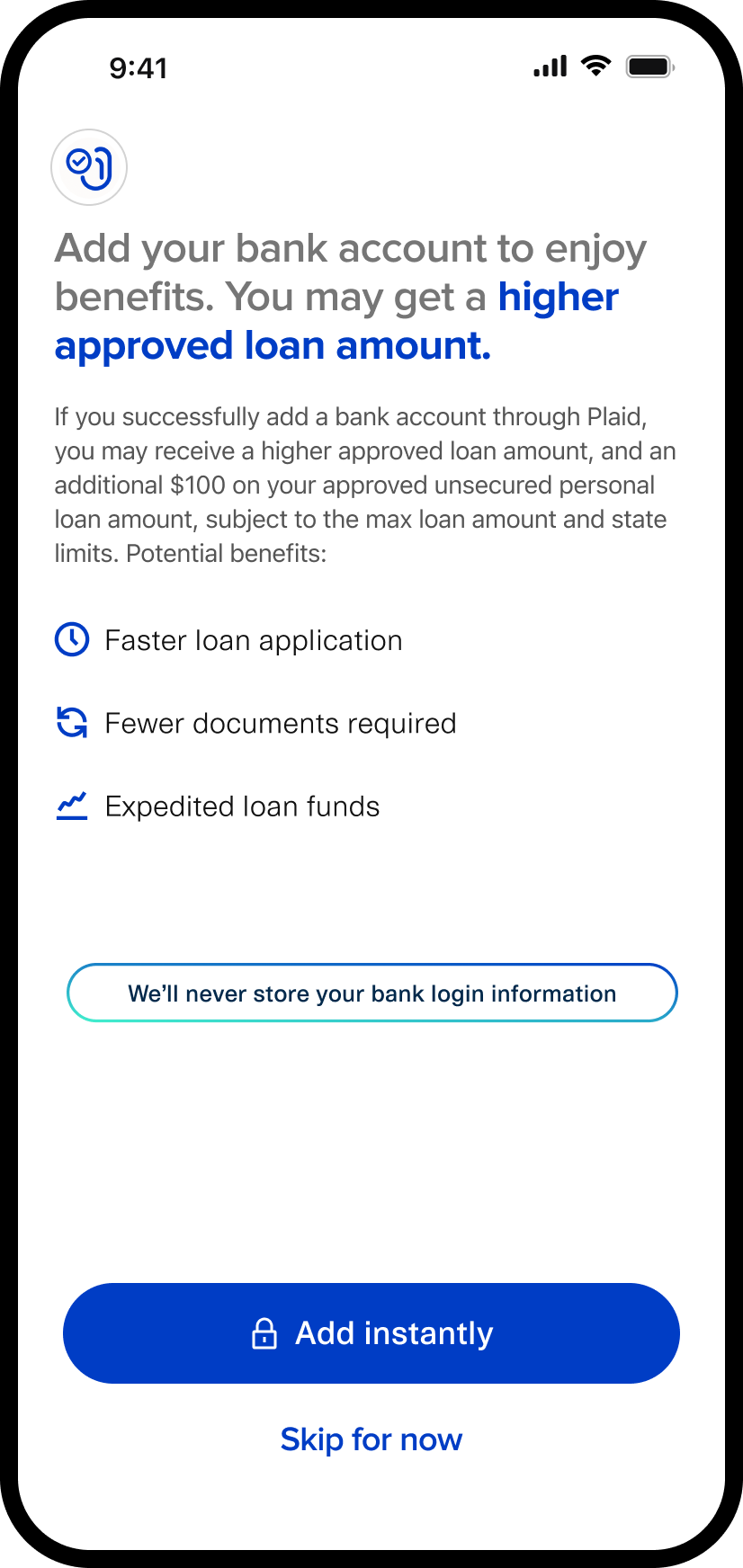
This pane puts a strong financial benefit to the end user in the headline ("You may get a higher approved loan amount"). It uses three bullets, one of which is a strong financial benefit to the user (expedited funds access), which justifies the inclusion of a third bullet. It also concisely makes it clear that Plaid is secure, uses direct "add a bank account" language, and positions Plaid as the default.
Personal financial management example
This pre-Link pane conveys the benefit to the user, explains that Link is secure, and contains a link to additional security messaging with more detail on security practices, including an explanation of how the user can manage their linked account.
Email messaging example
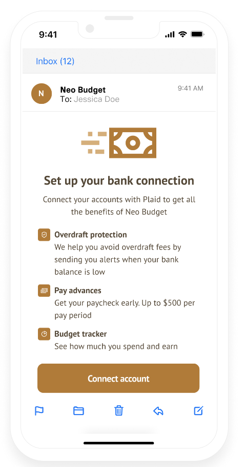
This followup email, sent when a user does not link an account within 24 hours of signing up for the app, uses the same branding as the main app, contains a clear call to action, and explains the benefits of Link and why the user should link their account.
Post-Link messaging best practices
While post-Link messaging has a less direct impact on conversion, it can still impact the confidence your users have in Plaid and in your app.
Present a success screen
Let the user know that they successfully linked their account to your app. You can also show some of the data that your app has collected, so that the user can have proof that the link process worked correctly. If applicable, have a CTA on this screen that allows them to link another account.
Allow users to manage linked Items
Having an area within your app where users can view, manage, or remove linked Items is a privacy and security best practice. It can also minimize the risk of duplicate Items (when a user accidentally adds the same Item twice) and help users fix Items that are unhealthy and need to go through update mode.
Post-Link messaging example
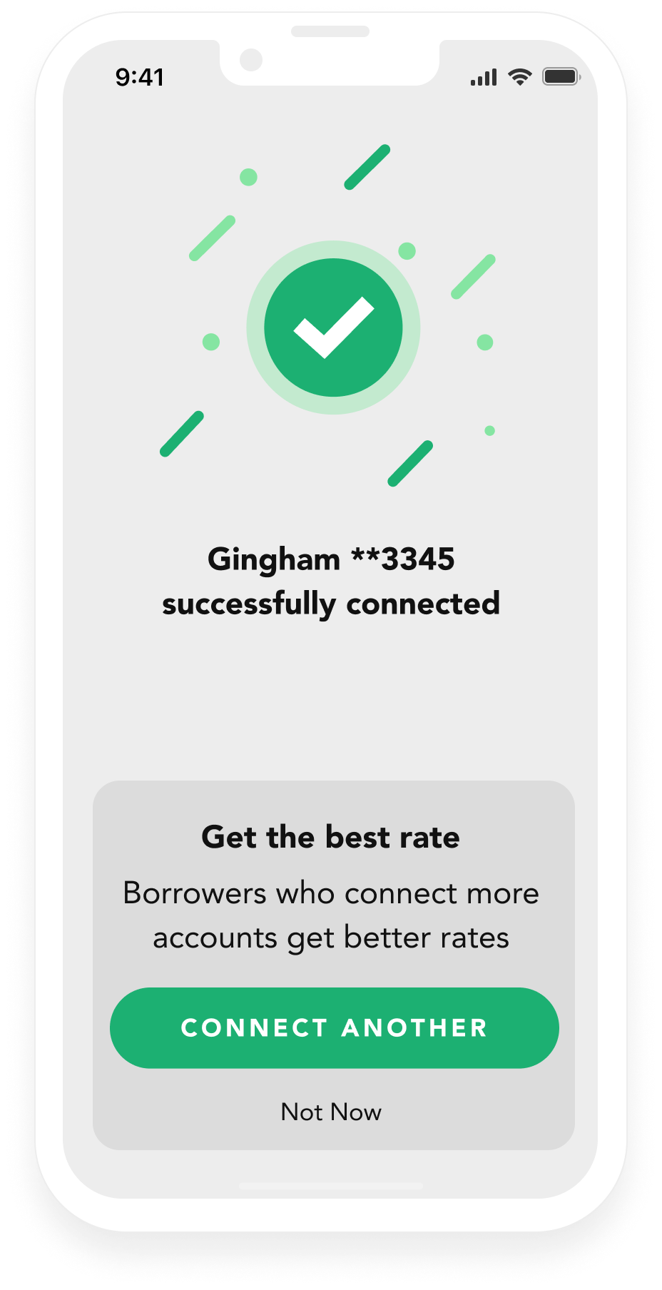
This post-Link pane includes a success screen to instill confidence. It incorporates the account mask, which lets the user know their account data was retrieved, and incorporates a call to action to link another account.
Next steps
To measure the impact of these steps or set up an experiment to evaluate them, see Measuring Link conversion. For more conversion maximization tips, see Maximizing Link conversion.